Published by Escort Marketing Agency (EMA) | Branding & Trust Series
There’s a particular kind of business frustration that comes from spending money on traffic and watching it disappear. Campaigns running, impressions climbing, click costs adding up — and the inquiry form sitting silent. Most operators in the adult sector assume the problem lies in their marketing. They adjust ad copy, shift budgets, and test new platforms. The traffic improves, sometimes significantly. The leads don’t.
The actual problem, in the majority of cases, is the destination. Not what’s driving people to the website — but what they encounter when they arrive, and why that experience quietly convinces them to leave before committing to anything.
Adult web design is a discipline with specific stakes. The audience carries a higher-than-average threshold of skepticism. The purchase decision — whether that’s a booking, a membership, or an inquiry — often involves personal exposure the visitor is not comfortable making on a site that doesn’t feel credibly professional. Every design mistake, every broken trust signal, every clunky navigation decision is therefore not just a UX issue. It’s a revenue leak. And most of these leaks share a predictable profile.
The Myth of the “Good Enough” Homepage
Walk into any industry conversation about adult website performance, and someone will eventually suggest that homepage quality doesn’t matter as much in this vertical — that the audience is motivated enough to convert despite friction. It’s one of the most expensive assumptions a brand can make.
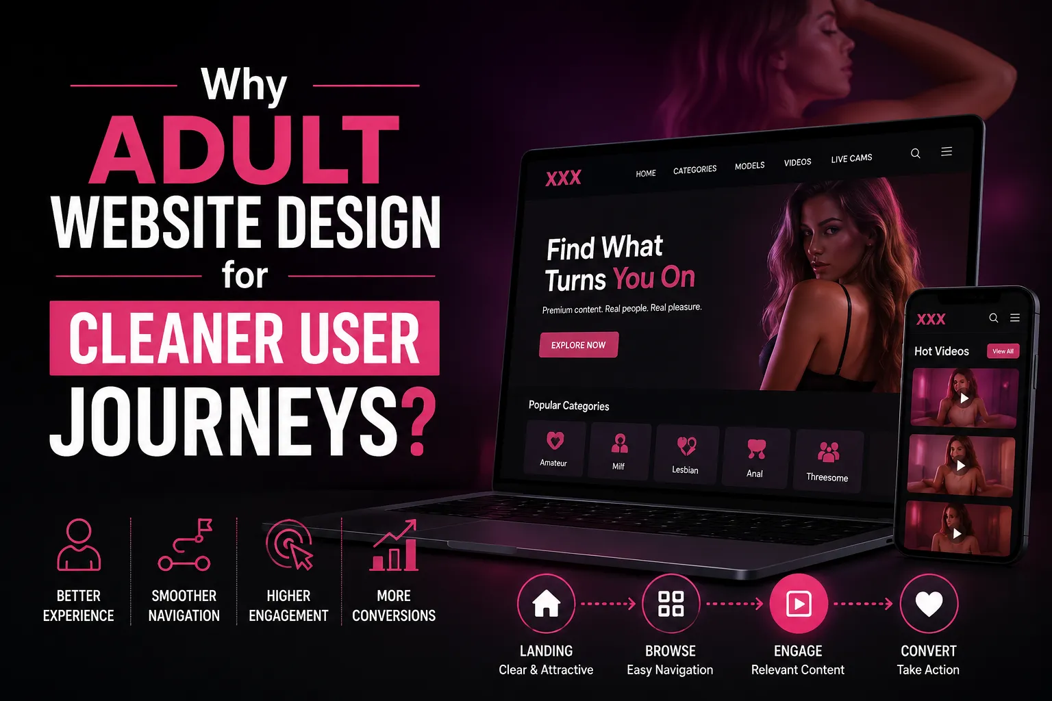
The homepage of a premium SEO-friendly adult website design is doing several jobs simultaneously, and failing at any one of them introduces drag on the entire funnel. It’s communicating brand positioning. It’s establishing security. It’s qualifying the visitor and guiding their next step — all within the first several seconds of a session in which the visitor has one thumb hovering over the back button.
The most common homepage failure EMA encounters when auditing adult brand websites is the absence of a clear positioning statement. Not a tagline, necessarily — something more specific than that. A declaration of what kind of experience this brand provides, for whom, and why it’s worth trusting.
Without that, a visitor who has found you through a search query, an ad, or a referral has no immediate frame for what they’ve arrived at. The page looks like many other pages in the category, and the differentiation that might exist further down the site never gets seen.
A second homepage failure, closely related, is the over-reliance on visual aesthetics in place of functional trust architecture. Beautiful photography and premium styling matter — they matter a great deal — but they don’t answer the questions a cautious visitor is silently asking.
Is this business legitimate? Is my data protected here? What do I actually do next? Design that answers those questions while also looking exceptional is considerably harder to execute than a design that simply looks impressive. The gap between those two outcomes is where most adult websites currently live.
Navigation That Confuses Is Navigation That Costs
The navigation structure of an adult website is, architecturally, a statement about the brand’s understanding of its own audience. When it’s built well — when it reflects a genuine analysis of how visitors move through the site and what information they’re seeking — it accelerates conversion. When it’s built casually, or copied from a template without strategic thought, it creates a maze that visitors exit rather than solve.
The specific failure that appears most frequently is a navigation menu that prioritizes internal organizational logic over visitor intent. Categories organized the way the site’s content team thinks about them, rather than the way a first-time visitor searches for them.
Menu labels that use industry jargon or creative naming rather than language the audience actually uses. Dropdown structures are so dense that the act of navigating them on mobile becomes a small ordeal.
Breadcrumb trails are underused and undervalued in this category. For an adult website with deep content or a service structure, breadcrumbs give visitors constant positional awareness — they know where they are, how they got there, and how to move laterally. Without them, a visitor who’s gone three or four levels into a site’s structure and wants to explore a different section will often abandon entirely rather than attempt to backtrack.
The mobile navigation experience deserves its own scrutiny. Hamburger menus are functional, but they require a tap before the site’s structure becomes visible, which means a visitor scanning for navigation cues on first arrival sees none.
For a category where the visitor is frequently browsing with discretion in mind, removing that scan-and-decide moment by hiding all navigation behind a menu icon can meaningfully reduce the depth of exploration that precedes a conversion decision.
Loading Speed and the Economics of Patience
Patience is not a virtue visitors extend to adult websites. The dynamic is different here than in categories where people arrive with research intent and a tolerance for slow pages. Adult website visitors, particularly those arriving via mobile, are making real-time decisions. A site that makes them wait is a site they leave.
According to a professional adult web design company, the technical causes of slow adult websites are usually predictable: uncompressed images served at resolutions appropriate for print rather than screen, no content delivery network in place to reduce latency for geographically distributed visitors, render-blocking scripts loading in sequence when they could load asynchronously, and shared hosting environments that create server response times no amount of front-end optimization can fully overcome.
What’s less commonly discussed is the way loading speed interacts specifically with trust perception in this category. A visitor who experiences a two-second lag before content appears doesn’t consciously think “this site is slow.”
They experience a vague unease that reads as “this site doesn’t feel right.” In a category where that unease already exists as a baseline — where every visitor is asking whether this is a real, legitimate, professionally operated business — a slow page doesn’t just create friction, it validates doubt.
The sites that compete effectively at the premium end of the adult market have, without exception, treated page performance as a brand investment rather than a technical concern. They’ve allocated budget to infrastructure, they’ve optimized asset delivery, and they’ve recognized that the experience of landing on their site and having it respond immediately and fluidly is itself a trust signal. One that pays dividends on every single visit.
The Inquiry Form Problem Nobody Talks About
Here is where a significant percentage of adult website lead generation fails, and where the failure is most structurally invisible to operators who aren’t measuring it carefully.
The inquiry form — the mechanism through which a visitor becomes a lead — is frequently treated as a functional afterthought. It is designed to collect information, not to convert. And in the process, it becomes one of the most effective attrition points on the entire site.
The most damaging form of mistakes isn’t technical. They’re psychological. A form that asks for more information than is strictly necessary for initial contact signals distrust to the visitor. It communicates that the business is conducting an intake process rather than opening a relationship.
A form with no context — no explanation of what happens after submission, no indication of response time, no assurance about how the information will be used — leaves the visitor in a moment of uncertainty precisely when commitment is being requested.
Form design in the adult sector also frequently ignores the discretion dimension entirely. A contact form that asks for a full name, a home address, and a phone number in a context where the visitor may be using a work device or a shared connection is not a conversion asset — it’s a barrier.
Rethinking what information is actually required at the point of initial contact, versus what can be gathered once trust is established through a first exchange, can produce lead volume improvements that far exceed anything a traffic campaign would generate at comparable cost.
There is also a visual design component here that receives too little attention. A form styled inconsistently with the rest of the site — different fonts, different color language, different interaction behaviors — creates a subconscious mismatch that reads as unprofessional. Every element of the conversion experience should feel like it belongs to the same carefully considered whole.
Credibility Signals: Present Everywhere, Implemented Almost Nowhere
The term “social proof” has been overused to the point of losing its meaning in most marketing conversations. But the underlying principle — that visitors calibrate their willingness to engage based on evidence of other people having engaged before them — is especially operative in the adult category, where the risk of a bad experience feels particularly personal.
The mistake isn’t a failure to understand this. Most adult brand operators know that credibility signals matter. The mistake is in how and where those signals are deployed. Testimonials buried in a dedicated “Reviews” page that requires deliberate navigation to find are generating approximately a third of the trust impact they’d produce if positioned within service pages, adjacent to calls to action, and in the visual path of a visitor who hasn’t yet committed to exploring deeper.
Video testimonials — where clients speak about their experience without compromising their own privacy — carry substantially more weight than written text, which can be fabricated and which experienced visitors know can be fabricated.
Even short-form audio or written testimonials that include specific, non-generic detail (“the communication before the appointment was exceptionally professional” rather than “highly recommended”) signal authenticity in ways that generic praise doesn’t approach.
Awards, press coverage, industry recognition, platform memberships, and professional affiliations — where these exist and where their display doesn’t conflict with operational discretion — should be present and visible. Not as a vanity wall, but as a quiet structural argument that this business operates in the world of legitimate enterprise rather than the margins of it.
What EMA Actually Fixes When We Rebuild Adult Brand Websites?
This is the point in the piece where it’s worth being direct about what professional intervention in this space actually looks like — because incremental tweaks do not bridge the gap between a site that functions and a site that performs.
When Escort Marketing Agency approaches an adult website redesign or audit, the conversation starts with lead flow analysis, not aesthetics. We map where visitors are entering, where they’re exiting, what they’re engaging with, and what the form data reveals about inquiry quality alongside inquiry volume. That analysis almost always surfaces a set of friction points that the site’s current operator hasn’t been able to see clearly from inside the experience.
From there, the work spans technical infrastructure (speed, security, structured data), user experience architecture (navigation, mobile optimization, accessibility), conversion design (form logic, CTA placement, trust signal distribution), and brand language (the specific messaging that makes a premium adult brand feel categorically distinct from its competition).
If your current website isn’t generating the inquiry volume your marketing investment should be producing, the reason is almost certainly structural — and it’s diagnosable. Our adult web design services are built specifically for brands in this category that are ready to close the gap between their real-world reputation and their digital representation.
The Brand Language Failure That Costs More Than Any Technical Issue
There is a category of adult web design mistakes that no amount of development work can fix, because it lives in the words rather than the code. It’s the one that, when present, undermines every other investment the brand has made.
Most adult websites, including many that look professionally designed, communicate in generic category language. The copy describes what the business does using the same vocabulary, the same sentence structures, and often the same approximate phrasing as hundreds of competitor sites. From a visitor’s perspective, the experience is one of reading about a service category rather than encountering a specific brand with a specific identity and a specific reason to be chosen over alternatives.
This concretely matters for lead generation. A visitor who can’t distinguish one adult brand from another on the basis of how each speaks about itself will make a decision based on price, convenience, or proximity. That’s a race toward commoditization that no premium brand can afford to run and win.
Specific, voice-driven copy that reflects a brand’s actual character — its aesthetic sensibility, its service philosophy, its understanding of what its clientele actually values — is not a creative indulgence. It’s a competitive moat.
The brands in the adult sector that generate consistent, high-quality leads share a quality that’s easy to overlook because it seems softer than technical execution: they sound like someone specific. Their website doesn’t just look professional — it has a point of view. And a visitor who resonates with that point of view doesn’t need to be converted. They’ve already decided.
Closing Observation
The mistakes outlined above are not the result of negligence or a lack of resources. In most cases, they’re the result of approaching adult web design as a content-delivery problem rather than a trust-architecture problem.
Once that frame shifts — once every design decision is evaluated through the lens of what it communicates to a cautious, discerning visitor rather than what it looks like on a design preview — the path to better lead generation becomes considerably clearer.
The adult sector rewards brands that do this well at a disproportionate level, precisely because so few do it well. The barrier to genuine premium positioning is not as high as it might appear from the outside. It requires discipline, strategic intent, and technical execution that treats the visitor’s experience with the same seriousness the brand applies to every other aspect of its operation.
The ceiling for what’s achievable with a well-built, trust-forward adult brand website is substantially higher than most operators in this space currently believe. Escort Marketing Agency exists specifically to help brands reach it.
Escort Marketing Agency (EMA) is a specialist digital marketing and web development firm providing trust-focused adult web design and growth strategy for premium adult brands.