There’s a useful thought experiment for any adult brand operator who wants to understand their website’s actual performance. Imagine someone who has never heard of your brand, found you through a search, arrived on your homepage on a mobile device, and has exactly forty-five seconds before their train reaches the next stop. What do they understand about your brand? What action have they taken? What reason have you given them to come back if they haven’t acted yet?
Most operators, when they sit with that scenario honestly, realize their website was never designed with that person in mind. It was designed to exist — to be a destination that traffic could be pointed at, to display services and imagery in some organized way, to have a contact mechanism somewhere.
The visitor’s actual cognitive journey through the site — the sequence of questions they’re silently asking, the moments where doubt appears, the specific friction points that interrupt momentum — was never modeled. It was assumed to sort itself out.
It doesn’t sort itself out. And in the adult sector, where the stakes of a poor first impression are higher than in almost any other vertical, the cost of that assumption accumulates quietly and continuously.
What does a “User Journey” Actually Mean in This Context?
The phrase gets used loosely, so it’s worth being specific. A user journey is the sequence of decisions a visitor makes from the moment they land on your site to the moment they either commit to an action — an inquiry, a booking, a subscription — or leave. Each step in that sequence is either supported by the design or complicated by it. There is no neutral.
What makes adult website user journeys categorically different from those in most other industries is the emotional texture of the experience. Visitors in this space are navigating a cocktail of curiosity, intent, and caution that doesn’t exist in quite the same configuration elsewhere.
They want to move forward, and they’re simultaneously scanning for reasons not to. Every design element they encounter is being unconsciously evaluated: Does this look like a real business? Does this feel secure? Is this environment one I want to spend time in and eventually exchange money or personal information with?
An adult web design company that understands this dynamic builds websites that address those questions structurally — through visual language, information hierarchy, response speed, and conversion architecture — rather than hoping the audience will overlook design deficiencies in pursuit of what they came for. The ones that build this way see the difference in their inquiry volume within weeks. The ones that don’t keep spending on traffic and wondering why the numbers never translate.
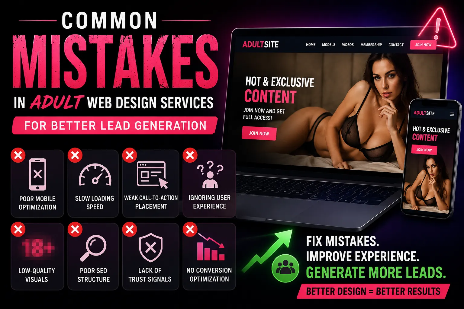
The Hierarchy Problem That Quietly Empties Funnels
Information hierarchy sounds abstract until you look at a specific website and notice that the most important thing — the one fact or impression that would compel a qualified visitor to take the next step — is buried three scrolls down the page, visually competing with four other elements at the same weight.
This is arguably the most common design failure EMA encounters when auditing adult brand websites. Not that the right content isn’t present, but that it isn’t prioritized. A page that treats a brand statement, a gallery, a pricing note, and a contact CTA as though they’re all equally important forces the visitor to do the organizational work themselves. Most don’t. They scan, find no clear signal about where to direct their attention, and leave without the site ever having made its case.
The discipline of visual hierarchy — establishing a clear primary focus for every page, a secondary element that supports it, and tertiary content that provides depth for visitors who want it — is what separates a website that guides from a website that merely displays. For an adult brand that has invested heavily in its real-world service quality and reputation, a website that merely displays is an expensive undersell.
Effective hierarchy in this category also means making decisive choices about what to lead with. A brand that serves a premium clientele should not lead its homepage with pricing. A brand whose service quality is its primary differentiator should not lead with a gallery of stock imagery.
The lead element is a strategic decision that communicates brand identity before a visitor has read a single word of copy — and when it’s made carelessly, the damage it does to positioning is difficult to reverse through any other means.
Mobile Journey Architecture: The Gap Most Adult Websites Are Still Ignoring
Desktop-first thinking in adult website design is not a relic of the early 2010s. It’s happening right now, in redesigns and new builds, because the people commissioning and reviewing those websites are often doing so on a desktop, approving what they see, and never fully inhabiting the experience their actual audience is having on a 6-inch screen with one hand.
The mobile user journey for an adult website has fundamentally different structural requirements than its desktop equivalent — not just visually, but in terms of how much cognitive work the design asks of the visitor.
On a desktop, a visitor can hold multiple panels of information in their visual field simultaneously and navigate non-linearly. On mobile, they move through a site sequentially, and the length of each scroll, the weight of each tap target, and the clarity of each transition either sustains their engagement or erodes it.
Sticky navigation on mobile — a top bar that remains accessible as the visitor scrolls — prevents the disorientation of arriving somewhere in the middle of a long page with no clear path back to orientation. It’s a small implementation choice that meaningfully reduces exit rates on mobile sessions.
Similarly, making sure that the primary CTA — whether that’s a booking button, an inquiry form trigger, or a WhatsApp contact link — is accessible without scrolling on initial mobile load is not a luxury feature. It’s an acknowledgment that mobile visitors operate on a different clock than desktop visitors, and that capturing their intent at the moment of peak interest requires no delay.
The brands in the adult sector that are currently achieving strong lead quality and volume on mobile aren’t doing so through exotic technology. They’re doing it by treating mobile as the primary design environment rather than an adaptation of the desktop experience — and by choosing a genuine adult web design company rather than a generalist agency that approaches this category the way it approaches any other.
The Three Moments Where Adult Website Journeys Break
Rather than describing the user journey as a smooth, continuous flow — which it rarely is — it’s more useful to identify the specific moments where visitors most commonly disconnect, because those moments are where design intervention has its greatest return.
The first break point is what might be called the legitimacy moment: the three to seven seconds after arrival when a visitor is assessing whether this website belongs to a real, professional business. The signals they’re reading are almost entirely visual and structural. Is the layout considered? Does the typography signal investment? Are there obvious signs of template construction — repeated patterns, placeholder-feeling imagery, navigation that echoes a hundred other sites in the category? A website that fails the legitimacy moment loses visitors who would have converted, and it does so silently, with no data that tells the operator why the session ended so quickly.
The second break point is the navigation moment: when a visitor, having passed the legitimacy test, attempts to find something specific and discovers that the site’s structure either doesn’t anticipate their intent or requires too much effort to traverse.
This is where information architecture decisions made months earlier in the design process start costing money. A visitor looking for a specific service type, a geographic availability note, or a rates reference who can’t find it within two intentional steps is a visitor who is now performing effort, and effort, in this context, converts to doubt.
The third break point is the commitment moment: the act of submitting a form, initiating a chat, making a payment, or taking any step that requires giving something — personal information, financial detail, or even just a name and email — to an entity they’ve known for less than three minutes.
This is where the trust architecture built throughout the rest of the experience either pays off or exposes its gaps. A visitor who arrives at this moment, having been guided through a clean, professional, reassuring journey, takes that final step with significantly lower hesitation than one who has been navigating friction and uncertainty to get there.
SEO-Friendly Adult Website Design and the User Journey Connection
There’s a version of SEO thinking that treats organic visibility and user experience as parallel concerns — you optimize for the algorithm, and separately you design for the human. That separation is outdated, and in the adult sector, it’s particularly costly.
Google’s evolving quality signals — engagement rate, time on site, return visits, page depth, and Core Web Vitals — are all measures of the user journey. A site that users navigate deeply, return to, and engage with substantively sends ranking signals that pure on-page optimization cannot replicate.
An SEO-friendly adult website design is, therefore, not primarily about keyword density and meta tags. It’s about building a site that real people find genuinely useful, navigable, and worth their time — and then making sure the technical architecture allows search engines to understand and index that experience correctly.
This integration matters for brands investing in both organic visibility and paid acquisition simultaneously. When the user journey is weak, paid traffic converts poorly, wasting spend. When the user journey is strong, but SEO architecture is neglected, the brand is permanently dependent on paid channels for visibility.
Building both disciplines into the design from the outset — with structured data, crawl-optimized URL structures, load performance at the infrastructure level, and content architecture that reflects search intent — is how adult brands build digital equity that compounds over time rather than requiring continuous reinvestment to sustain.
What EMA Builds When We Design for the User Journey?
When Escort Marketing Agency approaches a user journey redesign for an adult brand website, the process begins before any design work starts. It begins with session recording analysis, heatmap data, and form abandonment metrics — the evidence trail that an existing website leaves about where its visitors are losing confidence or losing direction.
That data shapes a journey map: a documented sequence of what a qualified visitor needs to experience, in what order, to move from initial arrival to inquiry submission. The map drives every subsequent design decision — what appears above the fold on mobile, how navigation is structured, where trust signals are placed relative to conversion points, what the form asks, and in what sequence.
The result isn’t a prettier version of the previous site. It’s a fundamentally different functional object — one built around visitor psychology rather than operator preference, and one whose performance can be measured, iterated on, and improved over time with the same discipline applied to any other business growth lever.
If your current adult website isn’t guiding visitors to action — if you’re seeing traffic without inquiries, sessions without depth, or form views without submissions — the journey architecture is almost certainly the explanation. Our adult web design services are designed specifically for brands in this category that are ready to understand why their site behaves the way it does, and to build something that behaves better.
The Overlooked Role of Micro-Interactions in Journey Quality
There’s a layer of user journey design that rarely features in adult website conversations, and its absence is noticeable even to visitors who couldn’t name what’s missing. Micro-interactions — the small animated responses that occur when a user hovers over a button, submits a form, loads a new page, or triggers any interactive element — are not decorative. They are a communication layer that tells visitors the site is responsive, alive, and competently built.
A button that changes state on hover tells a visitor it’s clickable before they click it — reducing hesitation. A form field that provides immediate validation feedback tells a visitor their input has been received correctly before they reach submission. A page transition that loads with visual continuity rather than a jarring blank-then-loaded sequence tells a visitor that their navigation action worked as expected.
These are not moments of delight so much as moments of reassurance — and in a category where reassurance is the primary emotional currency, accumulating those micro-moments throughout a journey adds up to an experience that feels categorically more professional than one that lacks them.
The brands that invest in this layer of execution are not necessarily spending more on design — they’re spending more deliberately. They’re making choices that most of their competitors haven’t thought to make, and those choices compound into a visitor experience that doesn’t feel like any other adult website the visitor has encountered.
The Question Behind Every Design Decision
There’s a framework that clarifies almost every adult website design decision, and it’s surprisingly simple: what does this element communicate to a first-time visitor who has no prior relationship with this brand?
Not what does it look like to the operator who approved it, or what does it mean to the team that built it — what does it communicate to someone encountering this brand for the first time, with all the skepticism and discernment that context implies?
Applied consistently, that question exposes the design choices that serve internal logic rather than visitor experience. The navigation item whose label makes sense to insiders but is meaningless to newcomers. The imagery was chosen because it’s visually striking rather than because it advances brand positioning. The form that collects information the business finds useful to have upfront, but that the visitor finds invasive to provide before any trust has been established.
Cleaning up those choices — replacing them with decisions that serve the visitor’s journey rather than the operator’s convenience — is not a one-time redesign task. It’s an ongoing discipline. The brands in the adult sector that do it consistently are the ones whose websites perform like business assets rather than digital brochures.
They generate inquiries with predictable regularity, they attract the quality of clientele that premium positioning promises, and they produce those outcomes not by outspending competitors on traffic but by converting that traffic at a rate that reflects how seriously the brand takes its digital environment.
Escort Marketing Agency was built to help brands reach that standard. The discipline is available. The execution is available. The only variable is whether your website is currently building toward it or quietly spending against it.
Escort Marketing Agency also know as EMA is a specialist digital marketing and web development firm delivering trust-focused adult web design and commercial growth strategy for premium adult brands.